A random post
Geospatial data visualisation in R
By Andrea Gabrio in random post data visualisation
December 30, 2020
Credit for all the code and work to Martin Schweinberger and its very nice webpage
Getting started with maps
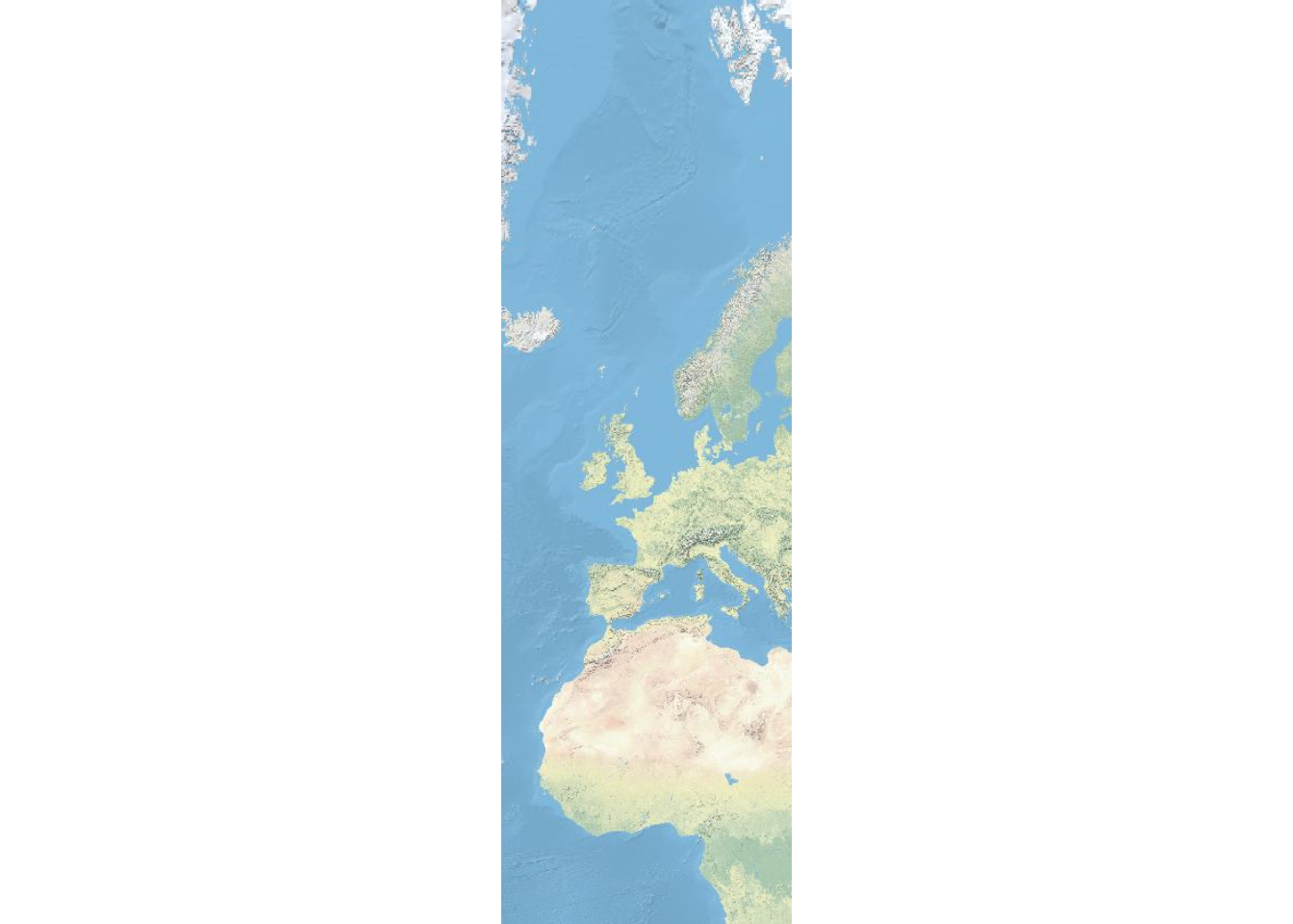
The most basic way to display geospatial data is to simply download and display a map. In order to do that, we load the libraries necessary for extracting and plotting the map. The package OpenStreetMap offers a range of maps with different features. To access the OpenStreetMap data base, it is necessary to install the package. Once the package is installed, we can simply extract the map and define the region we want to plot by defining the longitude and latitude of the upper left and lower right corner of the region we want to display.
# load library
library(OpenStreetMap)
# extract map
EuropeMap <- openmap(c(80,-23),
    c(-10,24),
#   type = "osm",
#   type = "esri",
    type = "nps",
    minNumTiles=7)
# plot map
plot(EuropeMap)
Generating maps with rnaturalearth and ggplot2
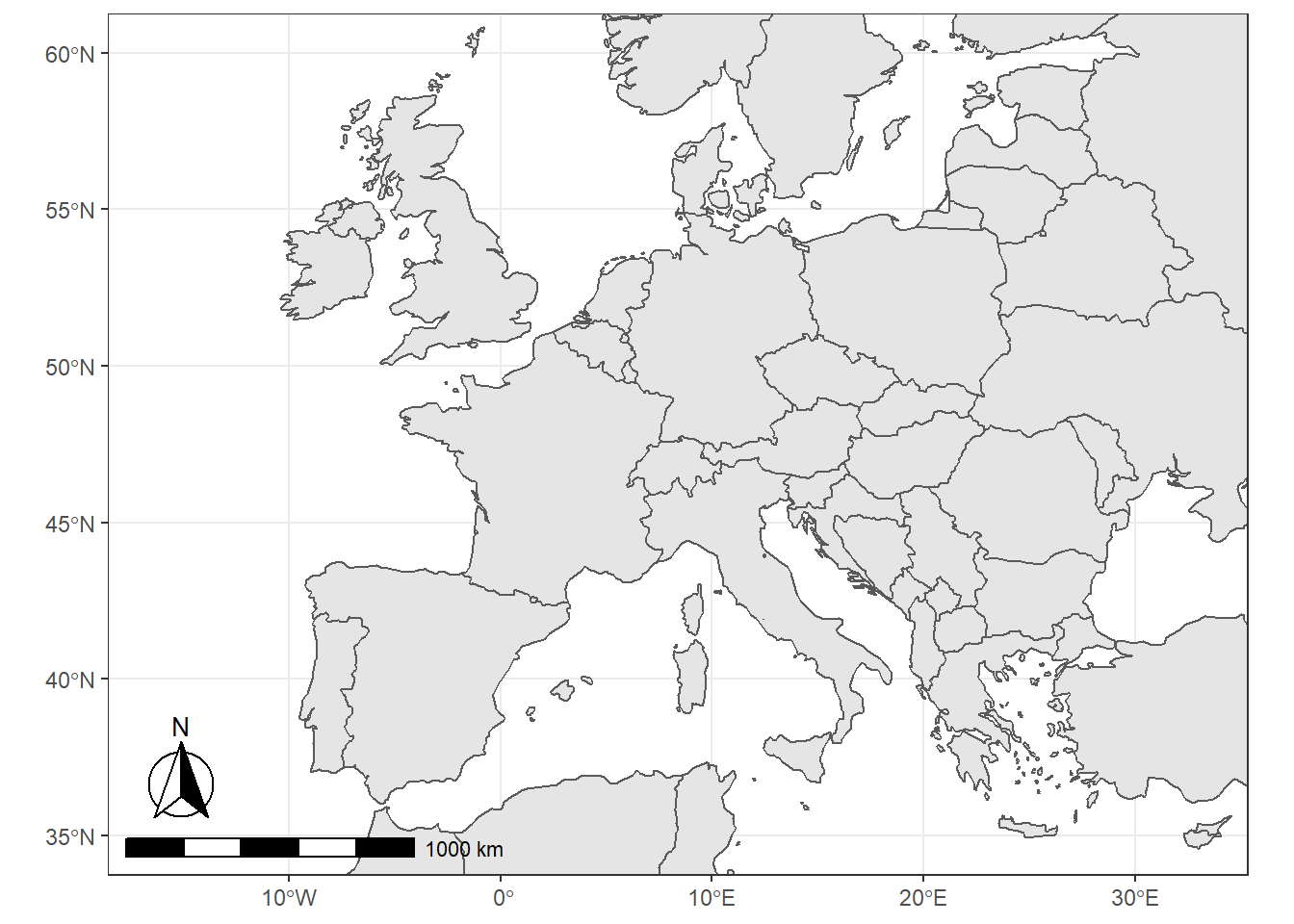
We can also use the data provided by the rnaturalearth and the rnaturalearthdata and use ggplot function from the ggplot2 package as well as the sf package to create very nice visualizations of geospatial data.
# load packages
library(tidyverse)
library(rnaturalearth)
library(rnaturalearthdata)
library(sf)
library(rgeos)
library(ggspatial)
# load data
world <- ne_countries(scale = "medium", returnclass = "sf")
# gene world map
ggplot(data = world) +
    geom_sf() +
    coord_sf(xlim = c(-16.1, 32.88),
             ylim = c(35, 60),
             expand = TRUE) +
    annotation_scale(location = "bl", width_hint = 0.5) +
    annotation_north_arrow(location = "bl", which_north = "true",
                         pad_x = unit(0.1, "in"), pad_y = unit(0.25, "in"),
                         style = north_arrow_fancy_orienteering) +
    theme_bw()
Customizing Maps
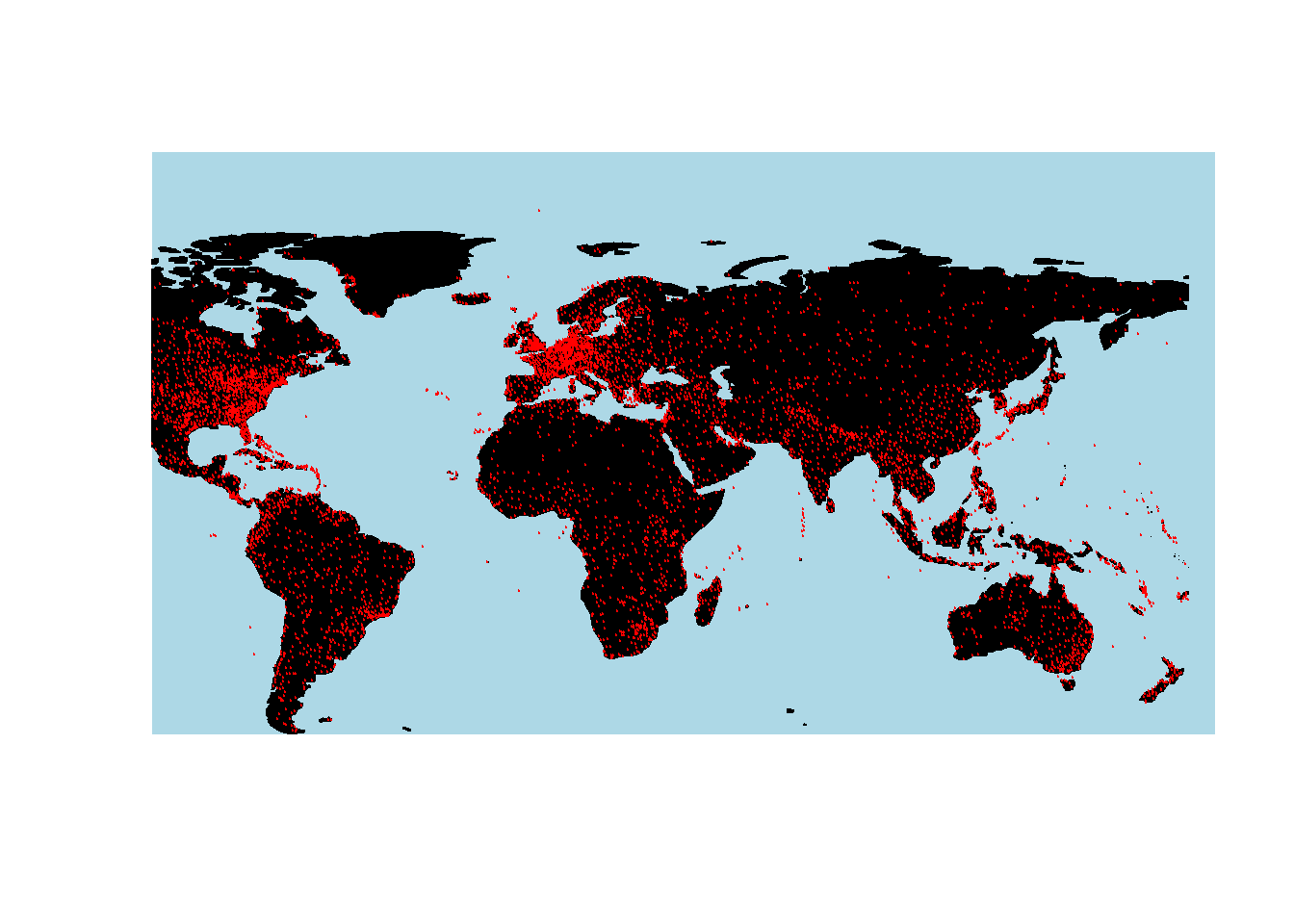
We load the airports data set which contains the longitude and latitude of airports across the world. We will then use this data to show the locations of airports across the globe.
library(data.table)
# load data
airports <- read.delim("https://slcladal.github.io/data/airports.txt", sep = "\t", header = T) %>%
  dplyr::mutate(ID = as.character(ID))
# inspect data
data.table(airports, rownames = FALSE, options = list(pageLength = 5, scrollX=T), filter = "none")
##          ID                                        Name         City
##    1:     1                              Goroka Airport       Goroka
##    2:     2                              Madang Airport       Madang
##    3:     3                Mount Hagen Kagamuga Airport  Mount Hagen
##    4:     4                              Nadzab Airport       Nadzab
##    5:     5 Port Moresby Jacksons International Airport Port Moresby
##   ---
## 7694: 14106                         Rogachyovo Air Base       Belaya
## 7695: 14107                       Ulan-Ude East Airport     Ulan Ude
## 7696: 14108                        Krechevitsy Air Base     Novgorod
## 7697: 14109                 Desierto de Atacama Airport      Copiapo
## 7698: 14110                          Melitopol Air Base    Melitopol
##                Country   Latitude Longitude rownames options filter
##    1: Papua New Guinea  -6.081690  145.3920    FALSE       5   none
##    2: Papua New Guinea  -5.207080  145.7890    FALSE    TRUE   none
##    3: Papua New Guinea  -5.826790  144.2960    FALSE       5   none
##    4: Papua New Guinea  -6.569803  146.7260    FALSE    TRUE   none
##    5: Papua New Guinea  -9.443380  147.2200    FALSE       5   none
##   ---
## 7694:           Russia  71.616699   52.4783    FALSE    TRUE   none
## 7695:           Russia  51.849998  107.7380    FALSE       5   none
## 7696:           Russia  58.625000   31.3850    FALSE    TRUE   none
## 7697:            Chile -27.261200  -70.7792    FALSE       5   none
## 7698:          Ukraine  46.880001   35.3050    FALSE    TRUE   none
To display the locations of airports on a map, we first plot the map and then add a layer of points to indicate the location of airports. In addition, the plot functions offers various arguments for customizing the display, e.g. by changing the background color (bg), defining the color of borders (borders), defining the color of the shapes (fill and col).
# plot data on world map
library(rworldmap)
# get map
worldmap <- getMap(resolution = "coarse")
# plot map
plot(worldmap, xlim = c(-80, 160), ylim = c(-50, 100),
     asp = 1, bg = "lightblue", col = "black", fill = T)
# add points
points(airports$Longitude, airports$Latitude,
       col = "red", cex = .01)
Color Coding Geospatial Information
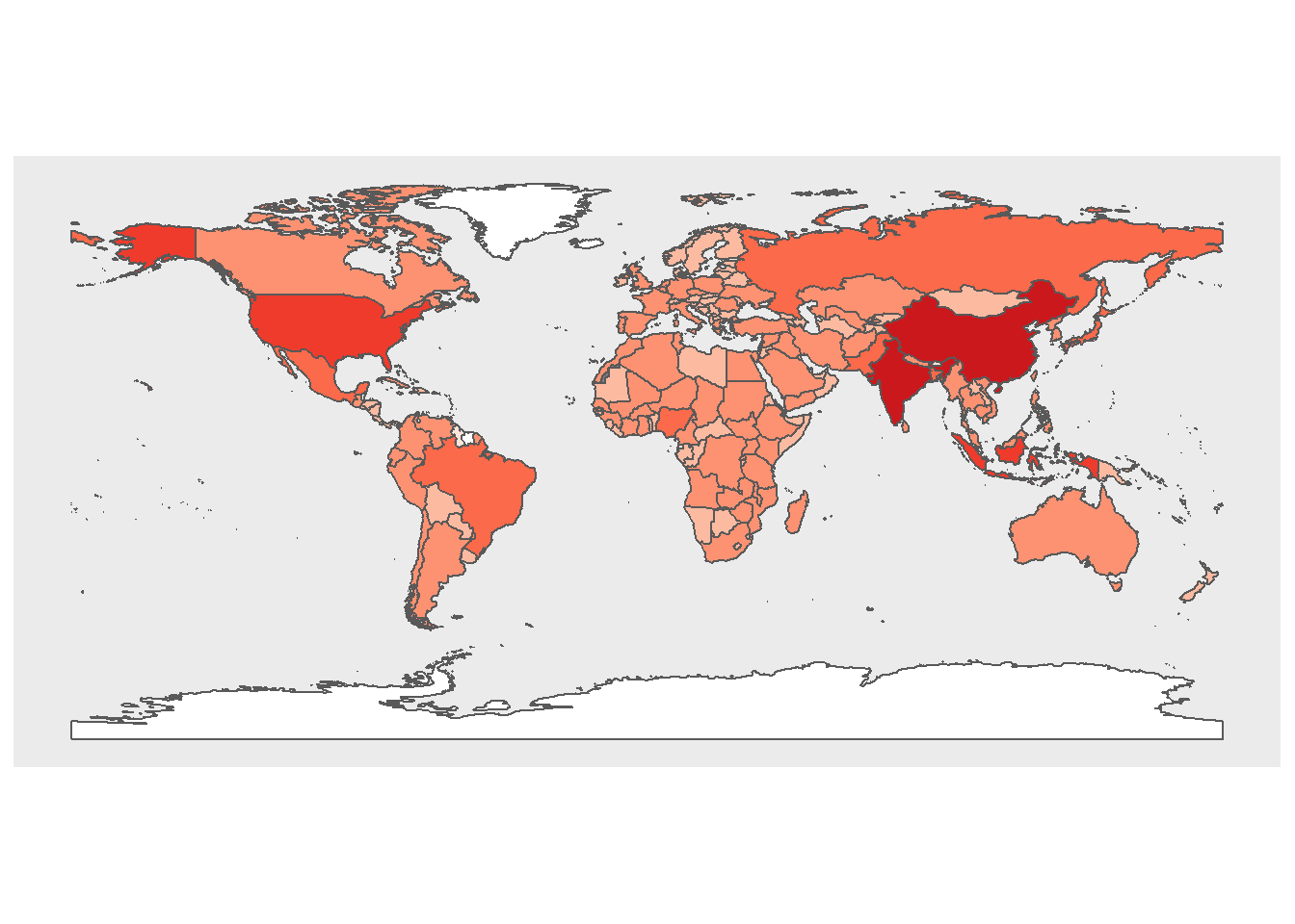
We can also use color coding of countries to convey information about different features of countries such as their population size (or results of political elections, etc.).
We use the data provided in the rnaturalearthdata and rnaturalearth packages, which contain information about the population size of countries, to color code and thus visualize differences in population size by country
# extract world data
world <- ne_countries(scale = "medium", returnclass = "sf")
# create cut off points in Population
world$pop_estC <- base::cut(world$pop_est,
                        breaks = c(0, 500000, 1000000, 10000000,
                                   100000000, 200000000, 500000000,
                                   10000000000),
                        labels = 1:7, right = F, ordered_result = T)
# load package for colors
library(RColorBrewer)
# define colors
palette = colorRampPalette(brewer.pal(n=7, name='Reds'))(7)
palette = c("white", palette)
# create map
worldpopmap <- ggplot() +
  geom_sf(data = world, aes(fill = pop_estC)) +
  scale_fill_manual(values = palette) +
  # customize legend title
  labs(fill = "Population Size") +
  theme(panel.grid.major = element_blank(),
        panel.grid.minor = element_blank(),
        # surpress legend
        legend.position = "none")
# display map
worldpopmap
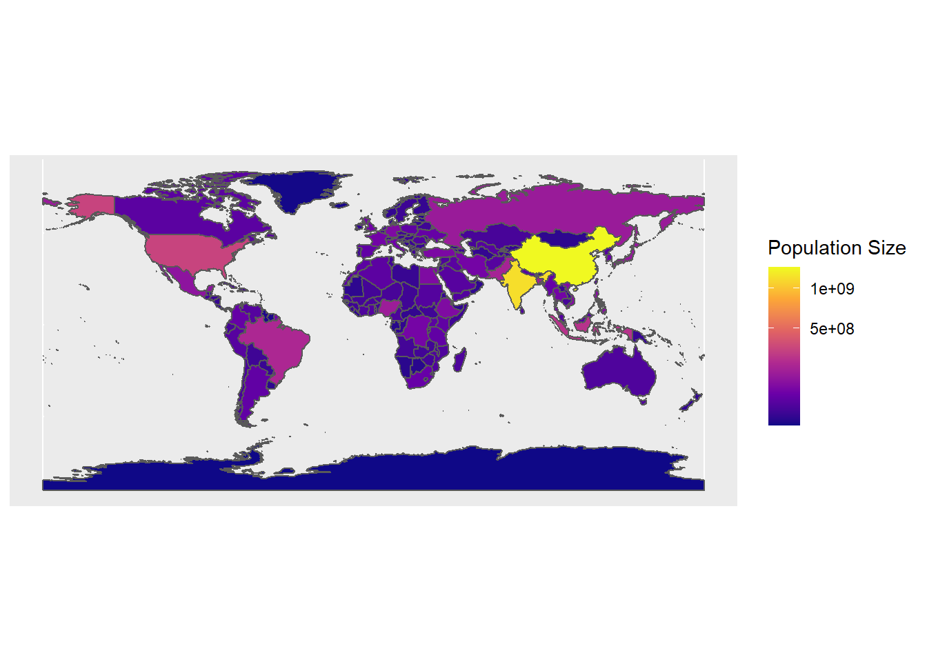
We can also scale the colors and add a legend to assist with the interpretation of the map.
# start plot
ggplot(data = world) +
    geom_sf(aes(fill = pop_est)) +
  scale_fill_viridis_c(option = "plasma", trans = "sqrt") +
  # customize legend title
  labs(fill = "Population Size")
Interactive Maps
You can also use the leaflet package to create interactive maps. The leaflet function from the leaflet package creates a leaflet-map using html-widgets. The widget can be rendered on HTML pages generated from R Markdown, Shiny, or other applications. The advantage in using this function lies in the fact that it offers very detailed maps which enable zooming in to very specific locations.
# load package
library(leaflet)
# load library
m <- leaflet() %>% setView(lng = 5.7002, lat = 50.8655, zoom = 12)
# display map
m %>% addTiles()
- Posted on:
- December 30, 2020
- Length:
- 5 minute read, 911 words
- Categories:
- random post data visualisation